Tag Archives: R

Problem

You want to use different shapes and line types in your graph.

Solution

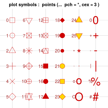
Note that with bitmap output, the filled symbols 15-18 may render without proper anti-aliasing; they can appear jagged, pixelated, and not properly centered, though this varies among platforms. Symbols 19 and 21-25 have an outline around the filled area, and will render with smoothed edges on most platforms. For symbols 21-25 to appear solid, you will also need to specify a fill (bg) color that is the same as the outline color (col); otherwise they will be hollow.

Standard graphics

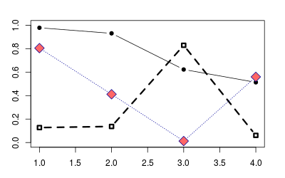
Use the pch option to set the shape, and use lty and lwd to set the line type and width. The line type can be specified by name or by number.

set.seed(331)

# Plot some points with lines
# Set up the plotting area
par(mar=c(3,3,2,2))
plot(NA, xlim=c(1,4), ylim=c(0,1))

# Plot solid circles with solid lines
points(1:4, runif(4), type="b", pch=19)
# Add open squares with dashed line, with heavier line width
points(1:4, runif(4), type="b", pch=0,  lty=2, lwd=3)

points(1:4, runif(4), type="b", pch=23,   # Diamond shape
       lty="dotted", cex=2,               # Dotted line, double-size shapes
       col="#000099", bg="#FF6666")       # blue line, red fill

ggplot2

With ggplot2, shapes and line types can be assigned overall (e.g., if you want all points to be squares, or all lines to be dashed), or they can be conditioned on a variable.

# Sample data
df <- read.table(header=T, text='
  cond xval yval
     A    1  2.0
     A    2  2.5
     B    1  3.0
     B    2  2.0
')


library(ggplot2)

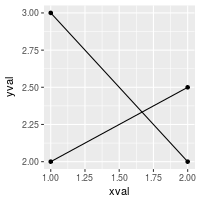
# Plot with standard lines and points
# group = cond tells it which points to connect with lines
ggplot(df, aes(x=xval, y=yval, group = cond)) +
    geom_line() +
    geom_point()

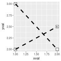
# Set overall shapes and line type
ggplot(df, aes(x=xval, y=yval, group = cond)) +
    geom_line(linetype="dashed",  # Dashed line
              size = 1.5) +       # Thicker line
    geom_point(shape = 0,         # Hollow squares
               size = 4)          # Large points

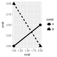
# Condition shapes and line type on variable cond
ggplot(df, aes(x=xval, y=yval, group = cond)) +
    geom_line(aes(linetype=cond), # Line type depends on cond
              size = 1.5) +       # Thicker line
    geom_point(aes(shape=cond),   # Shape depends on cond
               size = 4)          # Large points


# Same as previous, but also change the specific linetypes and
# shapes that are used
ggplot(df, aes(x=xval, y=yval, group = cond)) +
    geom_line(aes(linetype=cond), # Line type depends on cond
              size = 1.5) +       # Thicker line
    geom_point(aes(shape=cond),   # Shape depends on cond
               size = 4) +        # Large points
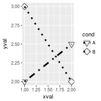
    scale_shape_manual(values=c(6,5)) +                  # Change shapes
    scale_linetype_manual(values=c("dotdash", "dotted")) # Change linetypes

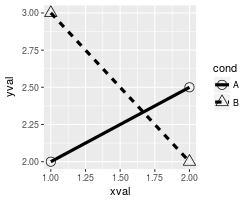
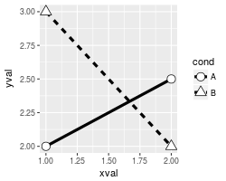
By default, ggplot2 uses solid shapes. If you want to use hollow shapes, without manually declaring each shape, you can use scale_shape(solid=FALSE). Note, however, that the lines will visible inside the shape. To avoid this, you can use shapes 21-25 and specify a white fill.

# Hollow shapes
ggplot(df, aes(x=xval, y=yval, group = cond)) +
    geom_line(aes(linetype=cond), # Line type depends on cond
              size = 1.5) +       # Thicker line
    geom_point(aes(shape=cond),   # Shape depends on cond
               size = 4)  +       # Large points
    scale_shape(solid=FALSE)

# Shapes with white fill
ggplot(df, aes(x=xval, y=yval, group = cond)) +
    geom_line(aes(linetype=cond), # Line type depends on cond
              size = 1.5) +       # Thicker line
    geom_point(aes(shape=cond),   # Shape depends on cond
               fill = "white",    # White fill
               size = 4)  +       # Large points
    scale_shape_manual(values=c(21,24))  # Shapes: Filled circle, triangle


Note

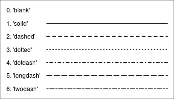
This code will generate the chart of line types seen at the top.

par(mar=c(0,0,0,0))

# Set up the plotting area
plot(NA, xlim=c(0,1), ylim=c(6.5, -0.5),
    xaxt="n", yaxt="n",
    xlab=NA, ylab=NA )

# Draw the lines
for (i in 0:6) {
    points(c(0.25,1), c(i,i), lty=i, lwd=2, type="l")
}
# Add labels
text(0, 0, "0. 'blank'"   ,  adj=c(0,.5))
text(0, 1, "1. 'solid'"   ,  adj=c(0,.5))
text(0, 2, "2. 'dashed'"  ,  adj=c(0,.5))
text(0, 3, "3. 'dotted'"  ,  adj=c(0,.5))
text(0, 4, "4. 'dotdash'" ,  adj=c(0,.5))
text(0, 5, "5. 'longdash'",  adj=c(0,.5))
text(0, 6, "6. 'twodash'" ,  adj=c(0,.5))
Bioconductor version: Release (3.7)

Multivariate data analysis and graphical display of microarray data. Functions include between group analysis and coinertia analysis. It contains functions that require ADE4.

Author: Aedin Culhane

Maintainer: Aedin Culhane <Aedin at jimmy.harvard.edu>

Citation (from within R, enter citation(“made4”)):

AC C, J T, G P, DG H (2005). “MADE4:an R package for multivariate analysis of gene expression data.” Bioinformatics, 21(11), 2789-90.

Installation

To install this package, start R and enter:
## try http:// if https:// URLs are not supported
source("https://bioconductor.org/biocLite.R")
biocLite("made4")

Documentation

To view documentation for the version of this package installed in your system, start R and enter:
browseVignettes("made4")

link: https://www.bioconductor.org/packages/release/bioc/html/made4.html

During startup – Warning messages:
1: Setting LC_CTYPE failed, using “C”
2: Setting LC_COLLATE failed, using “C”
3: Setting LC_TIME failed, using “C”
4: Setting LC_MESSAGES failed, using “C”
5: Setting LC_PAPER failed, using “C”
[R.app GUI 1.50 (6126) x86_64-apple-darwin9.8.0]

WARNING: You’re using a non-UTF8 locale, therefore only ASCII characters will work. Please read R for Mac OS X FAQ (see Help) section 9 and adjust your system preferences accordingly.


answer:

  1. Open Terminal
  2. Write or paste in: defaults write org.R-project.R force.LANG en_US.UTF-8
  3. Close Terminal
  4. Start R

library gplots中有一个很实用的热图工具,就是heatmap.2
提交的数据为矩阵,行列name可作为聚类后的标签
其中有很实用的参数
1.  行、列聚类树状图,热图,以及colorkey的位置排布
    可以用参数lmat,其中1代表热图,2代表行聚类树状图,3代表列聚类树状图,4代表colorkey,0代表空
    默认情况下lmat=rbind(c(4,3),c(2,1))  ,即colorkey在左上角
    根据lmat,画布被分为两行、两列,相应的你可以设置每行每列的宽和高,这就是参数lwid以及lhei。所以lwid向量的长度要与lmat中列的数目相等,lhei向量的长度要与lmat中行的数目相等
   例如 你 想把colorkey放在图的下方,可设置 lmat=rbind(c(0,3),c(2,1),c(0,4)) ,lhei=c(1,4,2),lwid=c(1,2) 。其中的长和宽其实就是代 表画布上你分配给各部分的量,例如此处lhei=c(1,4,2),则大约整个画布高度的1/7给第一行,4/7给第二行,2/7 给第三行  
2.  行、列标签字体大小
    可以使用参数cexCol、cexRow设置
  颜色设置使用col
    可以自己定义颜色向量,颜色代码可参考http://canghai2381.blog.163.com/blog/static/3400332420082192317234/ 
    相应的可以用breaks参数界定颜色分割的阈值
colorkey的显示
   key=FALSE可不显示colorkey,而density.info可以确定要不要在colorkey上显示直方图 
行、列标签的分类颜色
   RowSideColors、 ColSideColors参数可以为每一行/列定义对应分类的颜色,使用该颜色标记每一行或者列数据所属的类型
   例如有六列数据,分为两种类型,分别用红绿标记 ColSideColors=c(‘green’,’green’,’green’,’red’,’red’,’red’)
6 聚类图颜色范围
  做聚类图颜色很重要,一般采用greenred或者redgreen,但是有时可能需要其他渐变的颜色,就可以使用colorRampPalette参数,例如想要绿白蓝渐变,就可以设置col=colorRampPalette(c(“green”,”white”,”red”))
7 颜色分割点
  你设置的颜色可以选择是不是以0为对称,如果想对称,就可以令symkey=TRUE
  另外,就是你可能需要设置某一数值范围为一个颜色,这就可以使用breaks参数,例如你的颜色有八种
          定义函数colorsChoice<- colorRampPalette(c(“green”,”white”,”red”))
          产生8个渐变col=colorsChoice(8)
          8种颜色对应的数值区间breaks=c(-3,-2,-1,0,1,2,3,4,5)

#画带行列分类color的heatmap
library(gplots)
library(RColorBrewer)
mydata<-center.exp
hclustfunc <- function(x) hclust(x, method=”complete”)
distfunc <- function(x) dist(x, method=”euclidean”)

# perform clustering on rows and columns
cl.row <- hclustfunc(distfunc(mydata))
cl.col <- hclustfunc(distfunc(t(mydata)))

# extract cluster assignments; i.e. k=8 (rows) k=5 (columns)
gr.row <- cutree(cl.row, k=8)
gr.col <- cutree(cl.col, k=5)
# require(RColorBrewer)
col1 <- brewer.pal(8, “Set1”)
col2 <- brewer.pal(5, “Pastel1”)

# require(gplots)   
heatmap.2(as.matrix(mydata), hclustfun=hclustfunc, distfun=distfunc,  
         RowSideColors=col1[gr.row], ColSideColors=col2[gr.col])
        

#extract cluster based on dist
gr.row <- cutree(cl.row,h=2 )
gr.col <- cutree(cl.col, h=2)

# require(RColorBrewer)
col1 <- colorRampPalette(brewer.pal(0, “Set1”))(length(unique(gr.row)))
col2 <- colorRampPalette(brewer.pal(5, “Pastel1”))(length(unique(gr.col)))

# require(gplots)   
heatmap.2(as.matrix(mydata), hclustfun=hclustfunc, distfun=distfunc,  
         RowSideColors= col1[gr.row] , trace=”none”,col=greenred,Colv=FALSE)

京ICP备15063075号